Azure Node.js developer center homepage redesign
14 August 2012
As a PM at Microsoft, you frequently get thrown into new unfamiliar areas with the expectation that somehow you’ll figure out your way around. Just recently I had a first-hand experience with that as the team decided that it was time to refresh the Windows Azure Node.js developer center. The dev center first went live in December 2011, and since then it has received great new content, but the overall structure and the homepage in particular had changed very little. This was standing in the way of developers getting to our great content and resources, and was ultimately driving people away from trying Node.js on Azure.
Over the last three weeks I had the opportunity to work with some great folks across the Azure IX, UX, and PM teams and rethink our dev center. This is new to me, so I wanted to document my experiences here in blog series (hopefully). In this first part we will focus on the dev center homepage.
A big thanks to Molly Bostic, Lydia Bagwell, Jodie Eilers, Jesse Francisco, Brad Goring, Lucas Stanford, Larry Franks, and Mohit Srivastava, without whom none of this would have been possible.
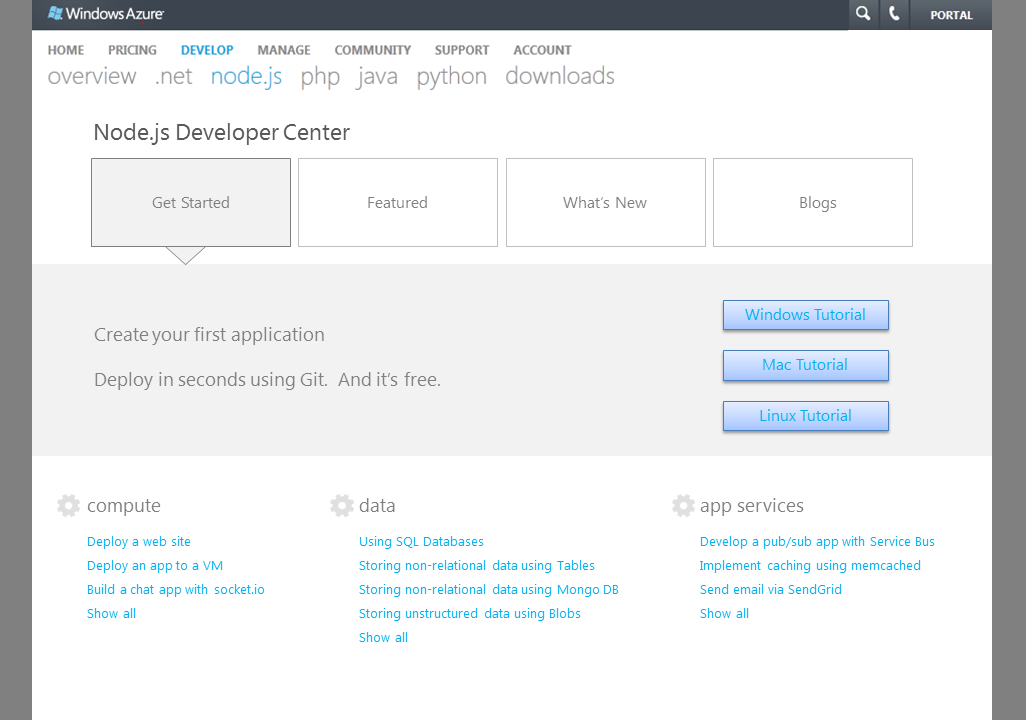
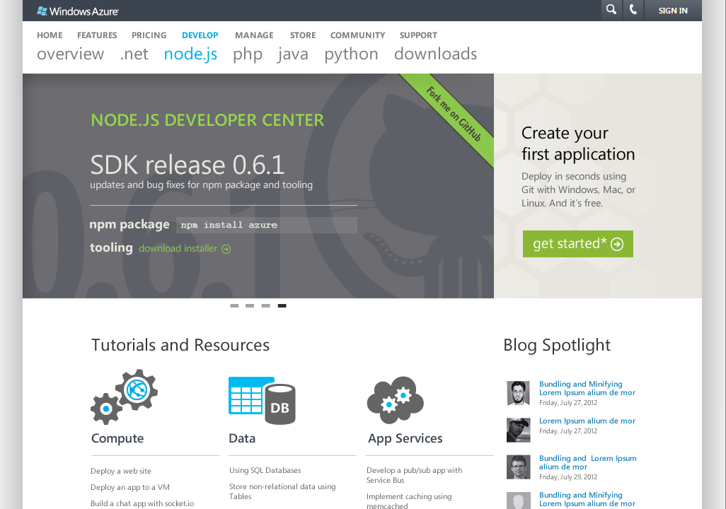
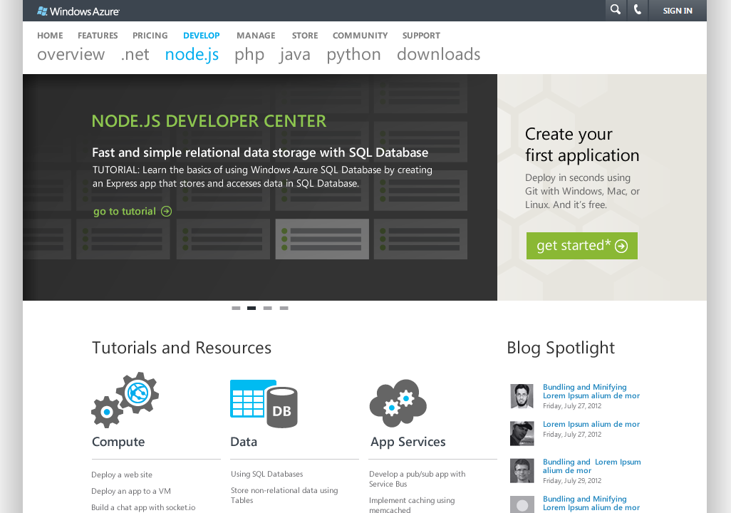
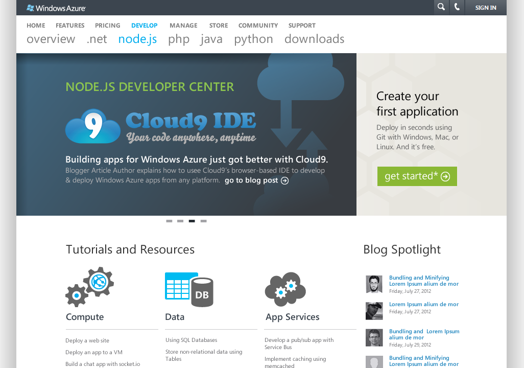
The current dev center
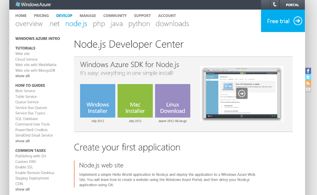
Let’s start with the current dev center and the approaches we used to identify issues folks were having with it. First, we reached out to our advisory community and collected some feedback:
- “there is way too much on this page”
- “make a clear single message/call to action above the fold”
- “get rid of the whole left hand items, it’s just clutter”
- “since one is on the Node page get rid of the other links to all the other languages… I want to see things about Node, not all the other stuff”
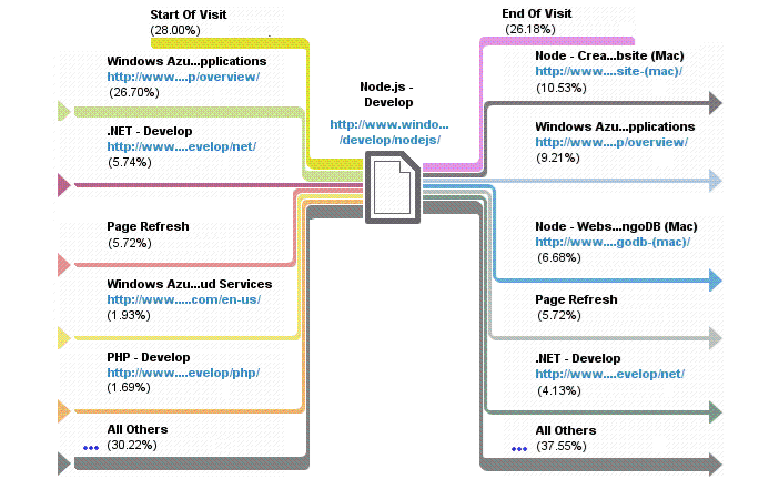
We then conducted a heat map study and looked at the page navigation patterns associated with the site.
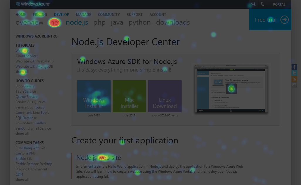
Some additional learnings emerged at this point:
- Based on the heat map and the flow of visitors from and to the other language developer centers (especially .NET), there seemed to be quite a bit of “browsing” behavior: folks simply exploring different Azure languages. We didn’t want to inhibit that flow, so we decided to keep the header that lets you quickly jump between languages
- There is a lot of flow to the tutorials on the page, especially the first tutorial we list on the page. Users tend to actively seek out tutorials, as seen in the heat map: it appears that tutorials are the preferred form of content.
- The prime real estate is understandably the middle of the page right above the fold
- Not many folks are clicking on the “free trial” button to sign up for Azure.
- Lots of folks are downloading the SDK, but is that all they need to get started? Wouldn’t reading a tutorial be a more useful?
Information Architecture
Before we set off to try and address this feedback, we formulated a set of principles to follow in the new design:
- Clear call to action
- Keep it fresh
- Reduce text-heaviness
- Improve content categorization
- Optimize click stream
Based on these principles we started sketching. First we played around on the whiteboard and then worked our thinking into wireframes. Here are some of the options that we considered at this stage of the design.
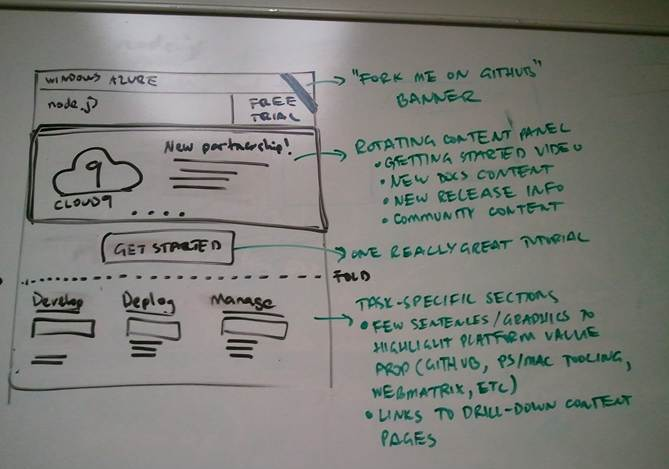
You will see that all of the sketches significantly reduce the amount of content and clutter on the page (especially above the fold), partly by removing the left-hand navigation. A single call to action is prominently featured above the fold in all of them. Fresh content is also prominent in all of the designs through the use of a carousel control.
Option 1 didn’t dedicate a permanent spot to the call to action we wanted to highlight. Option 3 caused the content categories (Compute, Data, App Services) to wrap and disrupt the flow of the page. Option 2 was selected and we proceeded with refining that.
Graphic Design
We then proceeded to produce high-fidelity screenshots of the selected option.
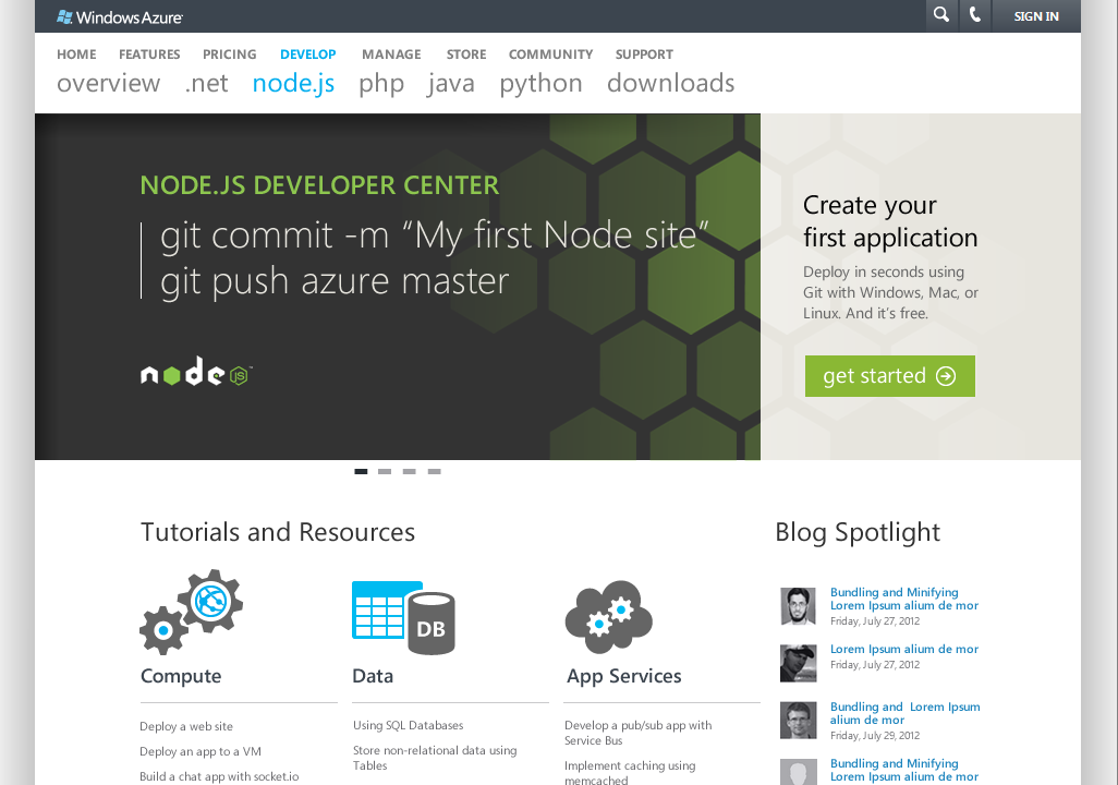
You will notice a few things that have changed. As the design team was working through this, they realized that the carousel with fresh content we were envisioning wouldn’t fit in the small area we had dedicated to it, so we had to invert the carousel and call to action areas. We did not want the call to action to get lost, so the first tile of the carousel was designed to naturally lead folks to get started. We also realized we wanted to maintain the blog spotlight area and it fit nicely alongside our three content categories.
To Production and Beyond
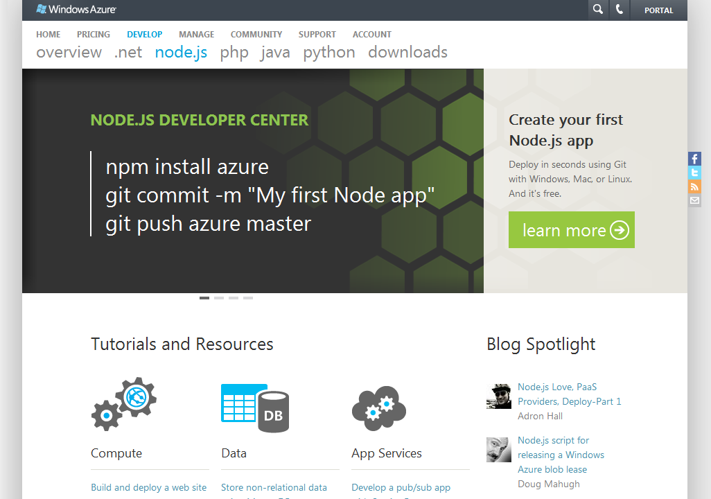
After a two week design phase and one week of implementation, we were able to push the new design into production and you can go check it out now.
Unfortunately, releasing the new dev center homepage is only half the battle. Over the next few weeks we plan to tackle 30+ documentation topics that the dev center contains and make sure each one of them is the best it can be. We are also keenly keeping an eye on a variety of metrics (including the heat maps and navigation data shown above) to make sure the new design is actually helping address the problems we set out to solve. We will continue to tweak and refine the design in response to that data and I hope to share the results as we make progress.
In the mean time, I would be glad to hear from all of you. Did you use the old or new Node.js dev center? Let me know what you think in the comments!